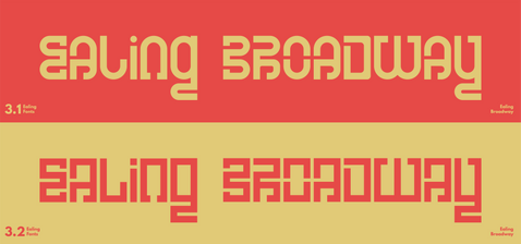
Fonts of Ealing
2021
Fonts of Ealing was a 4-week long academic project I undertook to improve my designing skills.
I started this project by considering my interests and flaws and realized that while I am quite good at many things there are just as many that I have shied away from improving on: both when it came to different fields and my design process. Because of this realization, I decided to take on a project that would push me to rely on my weaknesses, rather than my strengths.
By reflecting on my skills and process I realized that:
-
Typography is something I have often shied away from in the past
-
I have become too dependent on the online space for inspiration and research
-
I do not spend nearly enough time exploring concepts or collecting visual references as I go
-
I set my mind on a medium way too soon.
By considering these, I have established a process for this project that would consist of:
-
Collecting first-hand references from my location by exploring and utilizing psychogeographic strategies
-
Using collected references to sketch out different font variations based on different sides of my location
-
Polish these within the digital space.
As typography was my weak spot I decided to actively seek feedback from other creatives, and non-creatives, to ensure that what I made could be used by different people.
As a way to continue growing this project, I am currently working on turning these into fully functional typefaces that other creatives could use in their work.
Progress
Results


